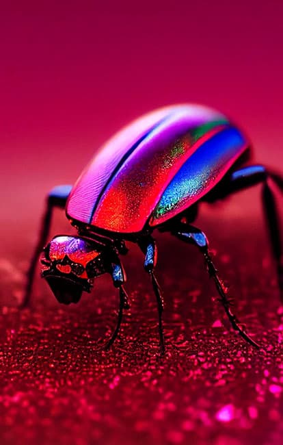
A color defined by a bold, natural balance, inspired by the red of the natural dye cochineal
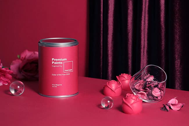
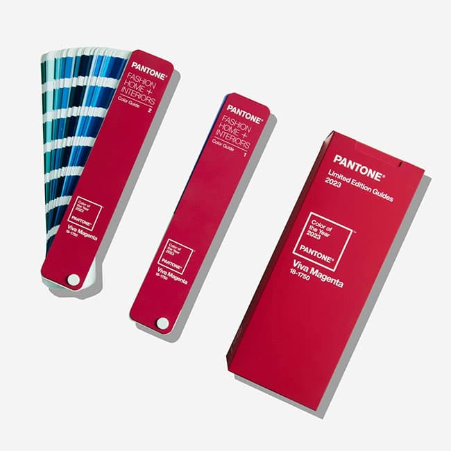
Pantone, the world-renowned color institute, has selected ‘Viva Magenta’ as its Color of the Year. Vibrant and energetic, ‘Viva Magenta’ is rooted in nature, descending from the red family, and signals a new source of strength. Brave and fearless, it is a pulsating color that writes a new narrative while promoting a joyful and optimistic celebration. Pantone explained that it chose the color for its bold yet natural balance.
Bold and full of wit, ‘Viva Magenta’ is a color that cheers on everyone with a passion for life and a pioneering spirit. Though it belongs to the red family, this year’s color ‘Viva Magenta’ is neither dominant nor aggressive, symbolizing a gentle exterior paired with inner strength. Striking a balance between warmth and coolness, this crimson-red-family ‘Viva Magenta’ is a hybrid color that comfortably bridges the physical and the virtual in a multidimensional world. The origin of ‘Viva Magenta’ lies in the cochineal beetle, an insect that produces carminic dye. It is one of the most precious as well as one of the strongest and brightest among the natural dye family, and Pantone explains that the red tone of ‘Viva Magenta’ psychologically connects us to primordial matter, drawing us in as a signal of primal strength. This shade of red was born by combining the abundance, warmth, and strength of natural materials with the rich, open horizons of the digital world.
Leatrice Eiseman, Executive Director of the Pantone Color Institute, said, “In this age of technology, we tend to draw inspiration from nature. Viva Magenta belongs to the red family and is inspired by the red of cochineal, one of the world’s strongest and brightest natural dyes and among the most precious of dyes.”
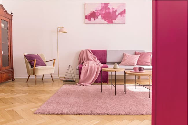
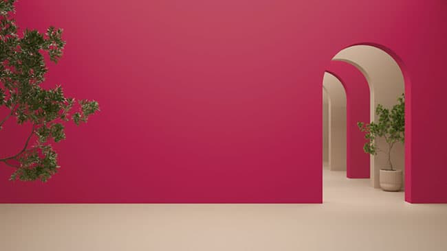
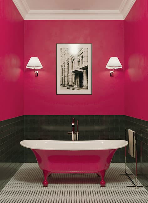
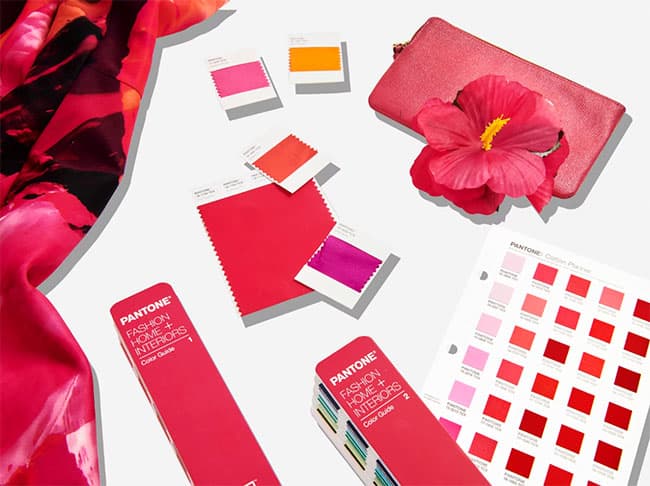
Announced by Pantone each year, the Color of the Year influences a wide range of industries and drives trends. In fashion, ‘Viva Magenta’ pairs well as an accessory with light gray, blue, and pastels, and for a monochromatic trend it is recommended to try it alongside pink. As a red that balances warmth and coolness, it is easy on the body while offering a fun and celebratory element. In home interiors, it can be used for wall paint, accent furniture, artwork, or home décor. It can also be used as a color that adds a bold accent to patterns, creating a captivating interior. In graphic design, it is a color that cuts through pale, neutral spaces on screen, and in the packaging and plastics fields, its vitality and passion can elicit a powerful consumer response.
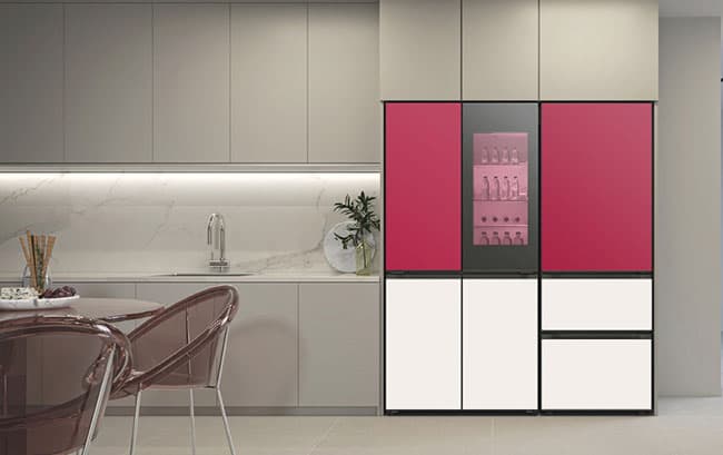
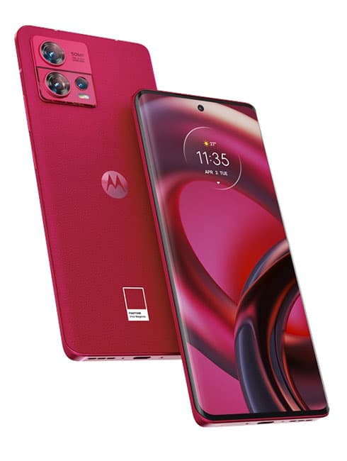
Collaborations with Pantone’s ‘Viva Magenta’ have also been introduced, including ▲Motorola devices ▲the art experience art house ‘ARTECHOUSE’ ▲pattern design ‘Spoonflower’ and ▲shoe brand ‘CARIUMA.’ In Korea, LG Electronics became the first to apply ‘Viva Magenta’ to a large home appliance, choosing it as the first upgrade color for the MoodUp feature of the ‘DIOS Objet Collection.’ LG Electronics is developing a range of colors, including those of the LG Objet Collection, together with Pantone so that consumers can complete their spatial interiors with the latest color trends, and it has been carrying out ongoing collaboration with the Pantone Color Institute.
Meanwhile, the Pantone Paint born from the collaboration between Noroo Paint and Pantone perfectly reproduces approximately 2,600 Pantone colors. The 2023 Color of the Year ‘Viva Magenta’ can be found in Pantone Paint across three application types (interior, wallpaper, and exterior).