Five color proposals conveying the idea of newly creating values that had grown weary and been overlooked during the pandemic
The Color Design Center of Samhwa Paints Industrial Co., Ltd. has selected 'Value Creation' as the keyword for its 2023 Color Nuance and proposed five colors.
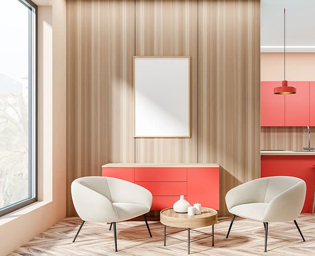
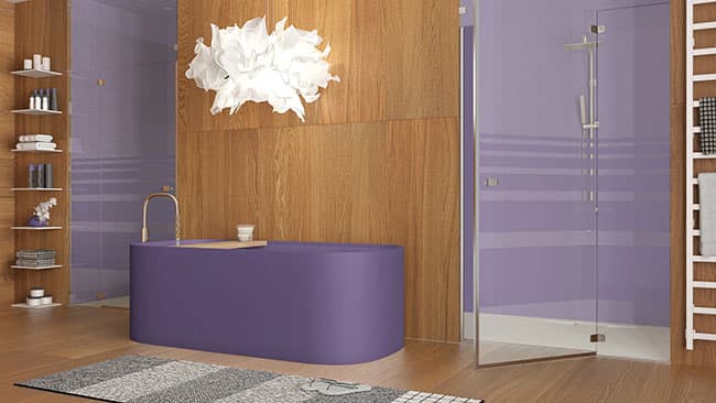
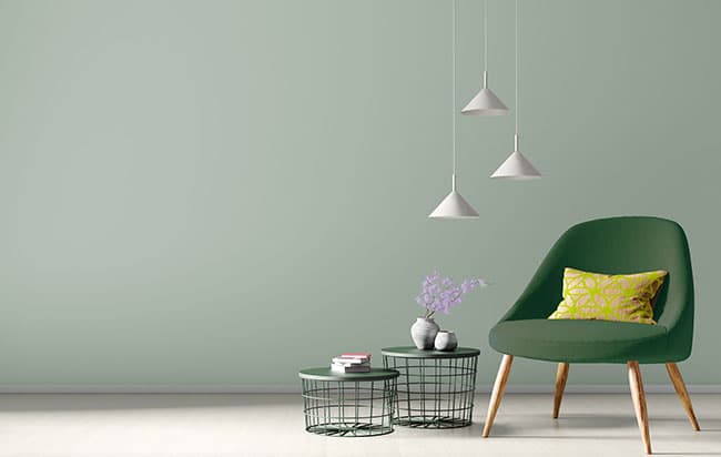
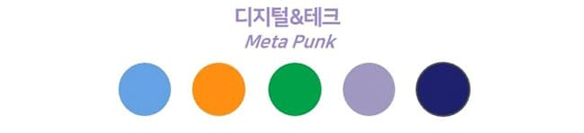
Samhwa Paints' 'Color Nuance of the Year' is a color derived from an analysis of global trends and future lifestyles, referring to a color flow that can be broadly applied across color design as a whole—including architecture and interiors, automobiles, and the IT industry. 'Value Creation' conveys the meaning of newly creating values that had grown weary and been overlooked during the prolonged COVID-19 pandemic. Based on the global industries transformed by the pandemic, Samhwa Paints proposed color trend themes and five colors to watch for in 2023–2024. The five colors expressing 'Value Creation' are ▲Sunshine Apricot, ▲Lime Sherbet, ▲Snow White, ▲Digital Lavender, and ▲Forest Green. Among these, the 'Sunshine Apricot' and 'Lime Sherbet' colors signify the innovative creativity of sublimating the isolated experiences of the pandemic period into delightful imagination; 'Snow White' represents essential value through organic colors and materials; 'Digital Lavender' expresses digital & tech meta-punk, embodying the convergence of social change and technology; and 'Forest Green' is a color signifying emotional care that pursues sustainability and the health of body and mind.
Color Trend Theme Ⅰ Innovative Creativity 'Sunshine Apricot & Lime Sherbet' This is a theme influenced by social change, the convergence of technology, and new values among the indicators of global megatrends. The isolation we experienced during the pandemic drives a desire for a joyful and pleasant environment, strongly showcasing strong color contrasts and design elements of symmetry and asymmetry. In innovative creativity, the colors are rendered in the rich hues of strong, vivid tones. The color application can be applied to a variety of fashion items using diverse impact effects and the near-neon 'Lime Sherbet' color. As a CMF strategy, it proposes tone-on-tone color schemes using contrasting color tones, complementary color schemes to create dynamic motifs, a harmony of bold texture and gloss, and patterns in forms such as color blocks.

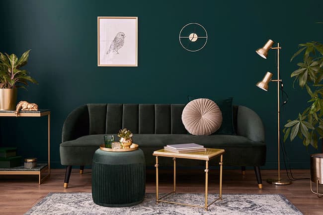
Color Trend Theme Ⅱ Emotional Care 'Forest Green' This is a theme influenced by sustainability, the health of body and mind, and new values. The pandemic had a negative impact on mental health worldwide. Owing to mental health issues, 85% reportedly experience sleep deprivation, reduced physical stamina, and feelings of depression. While the color direction of emotional care continues the demand for the pastel colors that had persisted since 2021, it proposes a calm and modern direction. Let us express it through a harmonious atmosphere of nature and color and a color mood applicable to various spaces and products. As a CMF strategy, it proposes expressing comfort through soft, curved forms, along with matte textures and wave-shaped relief patterns.

Color Trend Theme Ⅲ Digital & Tech 'Digital Lavender' This is a theme influenced by social change, the convergence of technology, and new values. Future-oriented technology provides functionality and aesthetics to spaces and enriches the interaction between objects and users. In addition, mixed reality blending the real and the virtual expresses surreal digital, and expresses bold, experimental design through unrealistic colors and textures. The color direction of digital & tech proposes sensuous colors that express digital wellness and the digital world, bright-tone pastel colors, a look that emphasizes rainbow effects, and a luminescent effect that emits bright light. The CMF strategy is the mix-and-matching of liquid textures and matte textures, and the use of futuristic finishing materials that apply lighting effects.
Color Trend Theme Ⅳ Essential Value 'Snow White' This is a theme influenced by sustainability, the health of body and mind, and new values. People place greater importance on the value of experiences gained through travel than on material possessions, and green travel for the environment—such as travel using eco-friendly raw materials—is becoming widespread. Sustainable materials, transparency, and practices for the circular economy are becoming basic premises to be put into practice across all industries, and organic colors and urban organic design are being widely used in interiors as well. Cases involving recycling, upcycling of marine waste, and biodegradable materials are also expanding. The color direction of essential value is a combination of warm and bright brown-family colors, burgundy red with a rich sense of hue, and neutral tones with emphasized texture. In particular, we hope you will naturally express the colors of wood, leather, and cork materials in which texture is emphasized. In the CMF strategy, tactile softness and visual texture become equally important, and it proposes planning products using waste as a material.