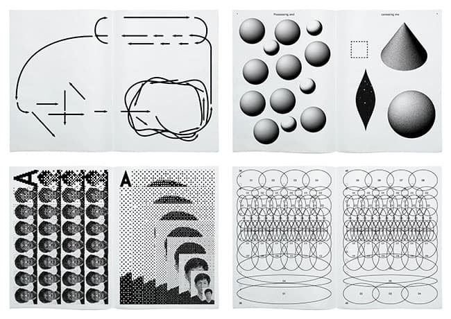
DDP Design Gallery presents <Jindallae & Park Woohyuk: Cosmos>
Expressing typography through graphics, video, installations and more
The art collective Jindallae & Park Woohyuk is holding the exhibition <Jindallae & Park Woohyuk: Cosmos> at the Dongdaemun Design Plaza (hereafter DDP), running through March 26 at the Design Gallery on the first floor of DDP.
You have probably seen an image in which country names are arranged in the shape of a world map, each sized and colored to match the country it represents. There is also a famous burger advertisement that renders the names of the ingredients used in a three-dimensional way that brings out their colors and textures. This is type design (hereafter typography), frequently used in the movie posters, magazines and advertisements we commonly encounter around us. Typography is used to reinforce the message a set of letters carries, or to heighten a particular mood, by rearranging or recombining such elements as typeface, size, letter spacing and word spacing.
Known in Korea for their work on the logotype for the film <Secret Sunshine>, the art collective Jindallae & Park Woohyuk expresses typography in this exhibition through the graphic, installation and video forms the two artists have been working in recently. The ‘Design Exhibition Series’ is a project that invites designers active in each field of design to take part as expert curators, thereby raising the expertise of the exhibition content and showcasing the vitality of current trends.
The theme of this exhibition is ‘Cosmos.’ When asked why they chose ‘Cosmos’ as the theme, the exhibition planners and artists Jindallae & Park Woohyuk explained: “Cosmos is a word that means the order of all things in the universe. Our various past attempts at work were uncertain and not fixed. But just as all things possess an order, looking back now, our work too was building a single world through a certain order and harmony. In that sense, we thought Cosmos was a word that could encapsulate and describe the journey of our work.”
Jindallae & Park Woohyuk’s graphic work begins with moving the ‘type’—the smallest and only truly typographic element. Techniques of part and whole, disassembly and assembly, repetition, and movement up, down, left and right are common elements across all of their graphic design work. Their work is grounded in the principles of typography, yet the letters are hard to make out. This is because the typography they envision places its emphasis not on ‘the form of letters and images’ but on ‘movement.’
The exhibition hall is designed with sculptures symbolizing organic matter of the universe, along with an exhibition design evoking a spaceship and outer space. The graphic design works Jindallae & Park Woohyuk have produced from the early 2000s to the present are shown as some 40 video pieces and some 120 printed pieces. Among the works to be exhibited are the irregularly published newspaper <Archive Annyeong, Issues 1–21>, published since 2011 in hopes of a peaceful (safe and sound) world, and the book design <Series of Entries from the Stanford Encyclopedia of Philosophy>.
The exhibition is held under the shared theme of ‘the universe’ during the <Seoul Light DDP> event, so visitors to DDP during this period can enjoy both the exhibition and the event at the same time. Admission is free.