
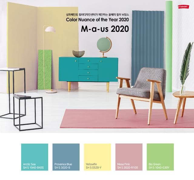
The Samhwa Paint Industry Color Design Center has named ‘M-a-us 2020’ as its Color Nuance of the Year for 2020 and proposed five colors.
‘M-a-us’ embodies the values of Momentum (growth), Almighty (strength), and Us (we).
△Momentum is a keyword of hope and excitement for 2020, a year expected to reach a major turning point as 5G (fifth-generation mobile communications), smart cities, and new mobility gain momentum. △Almighty is a keyword of positivity and strength that pursues a better world by using technology as a helper rather than a ruler of humankind. △Finally, Us is a keyword of coexistence and sustainability that pursues the convergence of nature and technology, convergence across industries, and online-offline convergence.
The five colors drawn from these keywords form a color palette consisting of △Arctic Sea (cool blue-green) △Provence Blue (soft blue) △Yellowfin (bright yellow) △Mesa Pink (pink) △Bio Green (bright green), expressing anticipation, hope, mystery, freshness, and positivity toward a new era.
The ‘Color Nuance of the Year,’ derived by the Samhwa Paint Color Design Center through analysis of global trends and future lifestyles, refers to a color flow that can be applied to a variety of color design–related fields such as interiors, automobiles, home appliances, and the IT industry.
Kim Hyang-ran, head of the Color Design Center, explained, “Color Nuance focuses on the color families that show the most pronounced increase in importance and influence within color-change trends identified through global research and other sources,” adding, “Because it proposes nuances that are important for emotional expression in color design, it can be used together with other trend colors.” 1544-5357